Every weekend, promoters lose money on events that should have sold out. The venue is right, the talent is booked, the night has potential — but the flyer is a mess. Wrong date, missing address, unreadable text, or a design so generic it gets scrolled past in half a second. Knowing what should be on a club flyer isn’t optional — it’s the difference between a packed room and an empty one.
This guide covers the 10 essential elements every club flyer needs, what to leave off, and how to make sure your design actually converts.
Why Your Club Flyer Design Matters More Than You Think
Your flyer is your event’s first impression. Before anyone buys a ticket, checks the venue, or tells their friends — they see your flyer. And in the nightlife world, perception is everything. A poorly designed flyer signals a poorly run event. A sharp, professional flyer signals a night worth attending.
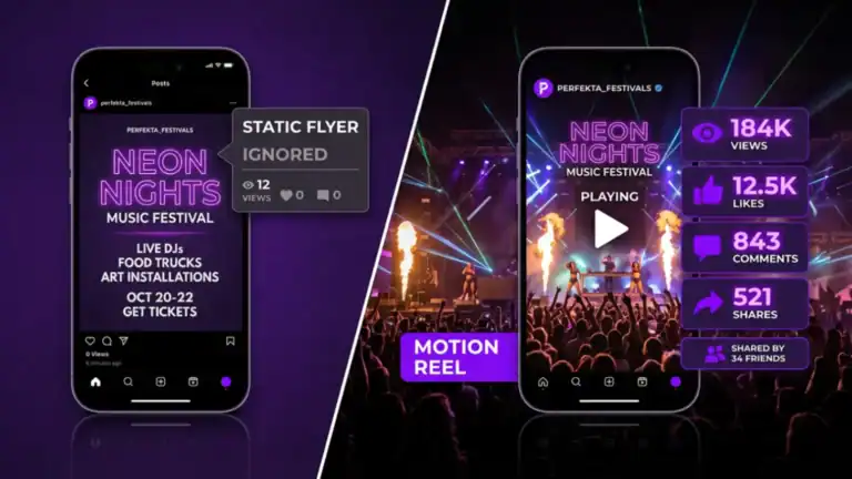
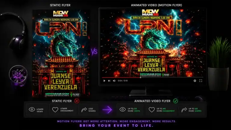
The stakes are even higher on Instagram, where your flyer competes with hundreds of other posts in a single scroll. Our own data from working with clients like LPN (La Puta Nota) shows that motion flyers generate over 6,000 more views than static flyers promoting the same event. Design quality directly impacts reach, and reach directly impacts turnout.
Bottom line: your flyer isn’t just decoration. It’s your most important marketing asset.
The 10 Essential Elements of a Club Flyer
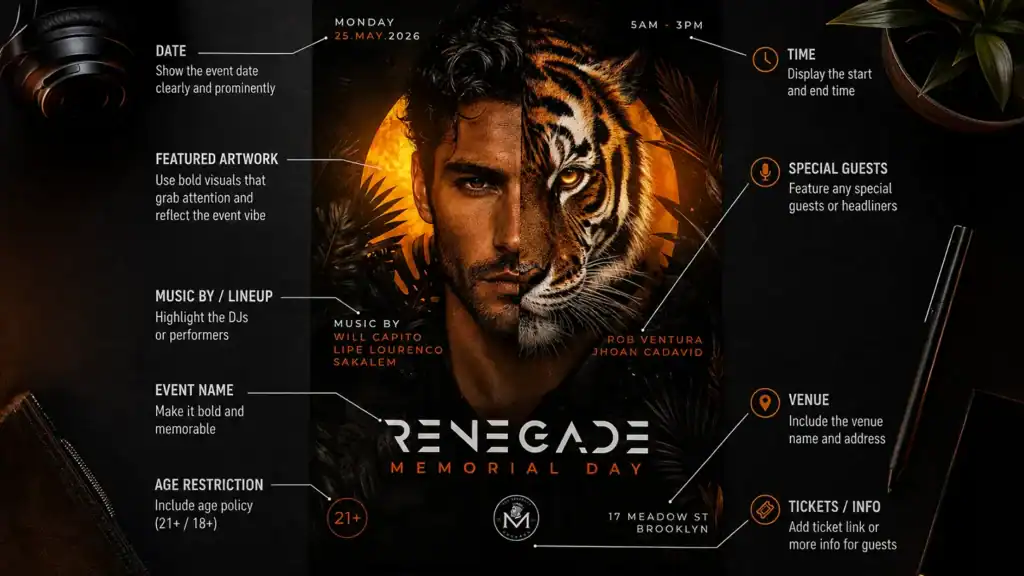
1. The Event Name
This is the most important element on the flyer — and it should look like it. The event name needs to be the biggest, boldest thing on the design. Whether it’s a recurring night like “Uptown Fridays” or a one-off like “MDW Climax,” it should be impossible to miss at thumbnail size. If someone has to squint to read the event name, the flyer has already failed.
2. The Date and Day of the Week
Never make someone do mental math to figure out when your event is. Include both the day of the week and the full date — “Saturday, May 25th” not just “May 25.” For late-night or early-morning events (afterparties, sunrise sets), make the timing crystal clear. “Monday Morning 5:30AM” is a selling point — but only if people can actually read it.
3. The Venue Name and Address
Your audience needs to know exactly where to show up. Include the venue name prominently and the street address in smaller text below. For well-known venues, the name alone may be enough. For smaller or newer spots, always include the full address — and consider adding a neighborhood name for context.
4. The Start Time
“Doors at 10PM” or “Show starts at 11:30PM” — whatever it is, put it on the flyer. If there’s a specific set time for a headliner, include that too. People plan their night around timing, and leaving it off is a friction point that costs you attendance.
5. The Headliner or Featured Artist
If you’re booking talent, their name needs real estate on the flyer. The bigger the name, the bigger the font. Supporting acts and special guests can appear in smaller text below. This is often the single biggest driver of ticket sales — give it the visibility it deserves.
6. Ticket Price or Cover Charge
Hiding the price creates friction and kills conversions. If it’s free entry, say so — that’s a major selling point. If there’s a cover, list it clearly. If there’s a tiered structure (advance vs. door, or VIP vs. general), include both. Transparency builds trust and removes the “I’ll figure it out when I get there” hesitation that leads to no-shows.
7. How to Get Tickets
A website URL, an Instagram handle, a ticketing platform link — whatever your method is, make it easy to find and act on. If you’re using an online platform, include the URL or a QR code. Every extra step between “I want to go” and “I bought a ticket” costs you sales.
8. Age and ID Requirements
“21+ with valid ID” or “18+ to enter” is non-negotiable for nightlife events. Leaving it off creates problems at the door and frustrates attendees who show up underprepared. Put it in small print at the bottom — it’s a standard part of every professional nightlife flyer.
9. A Strong Visual
The design itself is an element. Your flyer needs a visual that stops the scroll — a high-quality photo of the artist, a compelling graphic, or a striking background that matches the vibe of the event. Blurry images, stock photos, or generic templates communicate that the event itself isn’t worth the effort. Your visual sets expectations for the night.
10. Your Brand or Promoter Logo
If you’re building a brand as a promoter, venue, or production company, your logo should appear on every single flyer — usually bottom left or bottom right, small but visible. Over time, people associate your logo with quality events. It becomes a trust signal on its own, and it’s how you build a brand that outlasts any single event.
What Should NOT Be on a Club Flyer
Knowing what to leave off is just as important as knowing what to include.
- Too much text. If your flyer reads like a press release, it will be ignored. Every word should earn its place.
- Low-resolution images. A pixelated artist photo or blurry background tells people you didn’t care enough to get it right.
- Too many fonts. Stick to two, maximum three. Any more and the design looks chaotic.
- Outdated information. Wrong dates, cancelled artists, or old venue addresses are surprisingly common — and they destroy trust instantly.
- Cluttered layouts. White space (or dark space) is your friend. Let the design breathe.
Club Flyer Design Tips From the Pros
After designing thousands of flyers for promoters, DJs, and nightclubs across Miami, Orlando, Las Vegas, and beyond, here’s what we’ve learned:
Hierarchy drives everything. The visual hierarchy should go: event name → artist → date and venue → supporting details. If someone can absorb the key information in three seconds, the flyer is working.
Test it at thumbnail size. Before finalizing your design, shrink it down to Instagram story size and look at it from arm’s length. Can you still read the event name? Is the key information clear? If not, something needs to change.
Dark backgrounds perform better for nightlife. Dark, moody backgrounds with high-contrast text consistently outperform light designs for club events. They match the aesthetic of the event and stand out in a feed full of daytime content.
Motion flyers dramatically outperform static ones on Instagram. Animated versions of your flyer get significantly more reach, saves, and shares than the same design as a static image. If you’re only posting static flyers, you’re leaving visibility on the table. Read our full breakdown of why motion flyers get more Instagram reach.
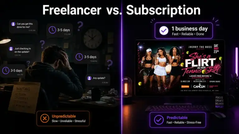
When to Hire a Professional Club Flyer Designer
DIY flyer tools like Canva are fine when you’re just getting started. But there’s a point where they start costing you more than they save.
If any of these sound familiar, it’s time to hire a pro:
- Your flyers look like everyone else’s because you’re using the same templates
- You’re spending 2-3 hours per flyer instead of focusing on event logistics
- Your design quality is inconsistent from week to week
- You need a motion flyer but don’t know how to animate
- You’re promoting multiple events per week and can’t keep up
A professional designer brings consistency, speed, and brand recognition. Your events start to look like a cohesive brand instead of a collection of one-offs — and that builds the kind of audience loyalty that fills venues on a recurring basis.
At Perfekta Unlimited, we specialize exclusively in nightlife design. Our subscribers get professional club flyer design with next-business-day turnaround on every request, for a flat monthly rate. No per-project fees, no back-and-forth on pricing — just great flyers, delivered fast.
If you’re tired of chasing freelancers or spending your own time on design, see our subscription plans and find out how much you’d save versus paying per flyer.